Your information has been submitted to our team, and someone will reach out to you shortly.

The TuneIn design system, referred to as “Marquee,” pairs a dynamic, adaptable logo with bright hits of color and asymmetrical layouts. This creates a smart, but not serious feel while the underlying grid provides stability. The clean, bold typography lends clarity and personality to the brand voice. Finally, overlapping layers and containers draw people in, showcasing the brand’s vibrant, diverse content while encouraging exploration.
The TuneIn logo is a modern twist on the classic radio station signage. The containers are a nod to radio's past (think "On Air" signs), while the dynamic, offset construction reinforces our modern digital nature. The TuneIn logo should never be recreated or otherwise manipulated. This is essential to maintain a consistent presentation of our identity.






View More
Primary: TuneIn
Caps Only: TUNEIN
Avoid:
Tune In
Tunein
Tune-In
TUNEin
tuneIN
TUNE IN
Tune_In
Our Sound Logo is designed to work across all programmatic formats and brand touch points. The three different lengths take into account our current needs for each potential placement, as well as future opportunities as we continue to build equity around our sound identity.
• Hero version
• Pre-roll
• After CE Device invocation
• TV commercials
• Sometimes used
• Abbreviated for repeated use
• Pre-roll
• After CE Device invocation
• Frequent use
• In-app
• Reinforcement after the long
form during a listening session
• Where time is short
• Sometimes used
To reinforce the tight link between our name and sound and further support brand recall, the vocal variations of our Sound Logo introduce a sung presentation of our brand identity.
The balanced layering of female and male voices singing in harmony amplify the human touch embedded in our sound and increase the energy and optimism that welcomes listeners to lean in and engage.
View More
TuneIn’s two signature colors are Ink and T Sharp. Ink is a deep blue color that is near black. It should be used whenever you would ordinarily use black (type, backgrounds, buttons, etc...). T Sharp is a brightened version of TuneIn’s previous brand color and should be used for big fills, large type, icons, etc... T Sharp should not be used for small copy on a white background or anything that has very fine details.

Hex: #1C203C
RGB: 28 / 32 / 60
CMYK: 62 / 47 / 0 / 76

HEX: #14D8CC
RGB: 20 / 216 / 204
CMYK: 63 / 0 / 30 / 0
Building on the foundation, this palette should be paired with content that is fun, energetic and not too serious.

HEX: #1C203C
RGB: 28 / 32 / 60
CMYK: 62 / 47 / 0 / 76

HEX: #14D8CC
RGB: 20 / 216 / 204
CMYK: 63 / 0 / 30 / 0

HEX: #FEC25A
RGB: 254 / 194 / 90
CMYK: 0 / 24 / 65 / 0

HEX: #FD685F
RGB: 253 / 104 / 95
CMYK: 0 / 60 / 47 / 0

HEX: #9FAEFD
RGB: 159 / 174 / 253
CMYK: 37 / 31 / 0 / 1

HEX: #45C6FF
RGB: 69 / 198 / 255
CMYK: 75 / 1 / 0 / 0
View More
Building on the foundation, this palette should be paired with content that is thought-provoking, serious and slower-paced.

HEX: #1C203C
RGB: 28 / 32 / 60
CMYK: 62 / 47 / 0 / 76

HEX: #14D8CC
RGB: 20 / 216 / 204
CMYK: 63 / 0 / 30 / 0

HEX: #DFC596
RGB: 223 / 197 / 150
CMYK: 0 / 12 / 33 / 13

HEX: #D6716D
RGB: 214 / 113 / 109
CMYK: 0 / 47 / 49 / 16

HEX: #A7A4A0
RGB: 167 / 164 / 160
0 / 2 / 4 / 35

HEX: #86A398
RGB: 134 / 163 / 152
CMYK: 18 / 0 / 7 / 36
View More
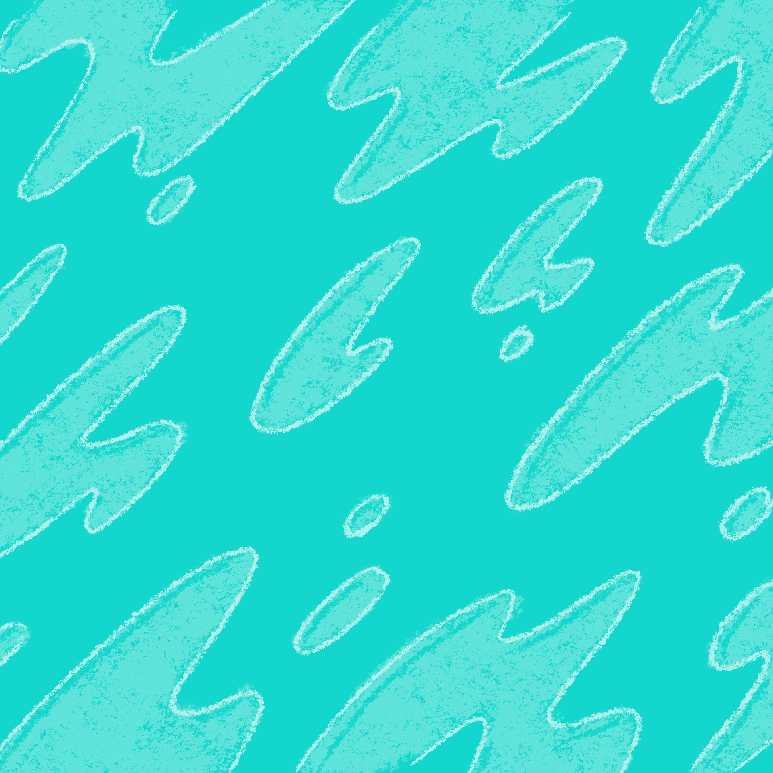
Below are downloads of our graphic patterns which can be used as background images for creative assets. Email marketing@tunein.com for final design approval.




View More
Cross Platform Font Options
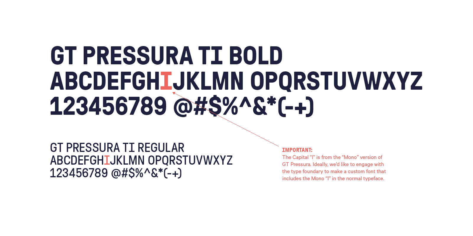
The key display typeface “GT Pressura” uses the visual effect of ink spreading under pressure as a stylistic device. The condensed sans serif alludes to a scientific background but with its rounded corners shows a soft and friendly side in larger sizes. The capital “I” from the Mono family has defining characteristics to the visual language.
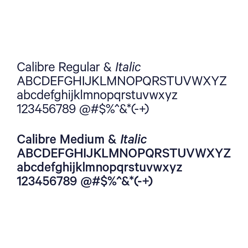
The standard utilitarian typeface Calibre is a geometric neo-grotesque. The type family is constructed from simple geometric shapes, circles and/ or rectangles. The same curves and lines are often repeated throughout the letters, resulting in minimal differentiation between letters.

Gazpacho is inspired by the serif typefaces used in editorial media in the 70s and 80s. The morphology of the letterforms makes this typeface ideal for display purposes like logos and big, bold headlines. Also, thanks to its large x-height, it works perfectly on headlines with tight leading. On the other hand, its high contrast and very simple and recognizable shapes make it highly readable, so it works on small, long texts as well.
The overall photographic tone should feel like you’re right in the middle of the scene. It should be honest, a little raw, and from the listener’s perspective.
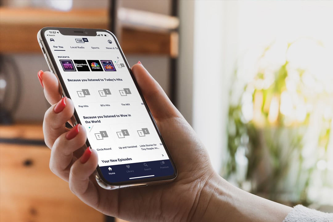
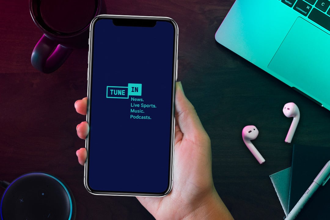
Easily drag and drop TuneIn User interface screen into our library of lifestyle shots.
The Iconographic should have a consistent construction to them so sizing, stroke weight, and curvature of the end points feel like a cohesive family. There should be a balance of fun and sophistication – “Smart, but not serious.”
View More
Below are TuneIn Call To Action logo lockups. Its primary job is to capture the attention of your leads and make them click through or listen to your content.


